The two-toned kitchen has become one of the defining design trends of the mid-2020s. When executed well, it adds depth, personality, and visual interest that a single-colour kitchen cannot achieve. When executed poorly, it looks like two different kitchens collided.
Here are the design rules I follow to make two-tone work every time.
The 70/30 Rule
The most important principle: one colour dominates, and the other is an accent. The ratio should be approximately 70% dominant colour to 30% accent colour. When you split 50/50, the kitchen feels indecisive — two equal voices competing for attention with no clear hierarchy.
How to apply the 70/30 rule:
- If your perimeter cabinets are white (70%), your island can be a contrasting colour (30%)
- If your lower cabinets are a warm wood (70%), your upper cabinets can be white or painted (30%)
- The dominant colour sets the tone; the accent colour adds interest
Where to Put the Accent Colour
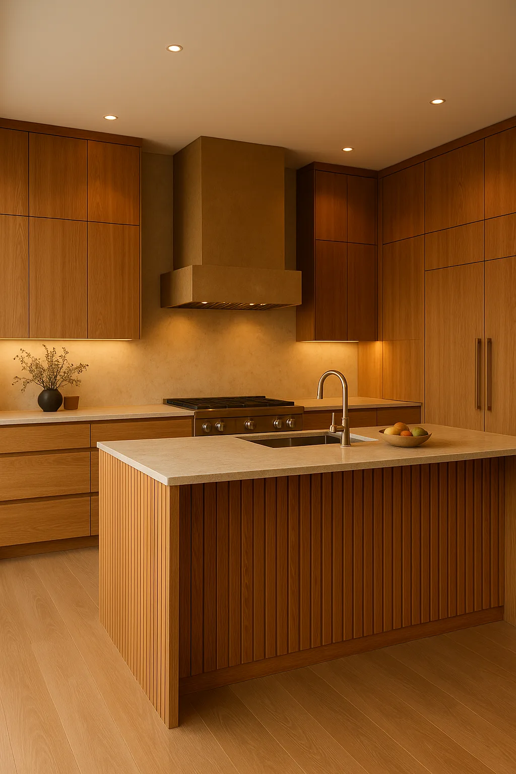
The Island (Most Common)
The island is the natural location for the accent colour because it is physically separated from the perimeter cabinets. The visual break is already established by the gap, so a colour change feels natural rather than arbitrary.
Popular island accent colours in 2025:
- Warm walnut or white oak (natural wood against painted perimeters)
- Navy or deep charcoal (dramatic contrast against white or cream perimeters)
- Sage green or olive (earthy, nature-inspired contrast)
- Rich greige or warm taupe (subtle, sophisticated contrast)
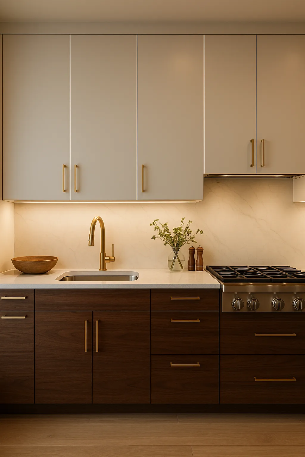
Upper vs. Lower Cabinets
Painting uppers and lowers in different colours or materials is a bolder approach. The conventional rule: lighter on top, darker on bottom. This mirrors the natural visual weight distribution — the ground is dark, the sky is light — and feels balanced.
The reverse (dark uppers, light lowers) can work but requires careful execution to avoid making the upper cabinets feel heavy and oppressive.
Accent Features
For a subtler approach, keep all cabinets the same colour but differentiate a single feature:
- A tall pantry cabinet or butler’s pantry in a contrasting finish
- Open shelving in natural wood flanking a painted hood surround
- Glass-front display cabinets in a different finish from solid-door cabinets
Colour Pairings That Work
The best two-tone combinations share an undertone. Mixing warm and cool tones within the same kitchen creates visual tension that feels wrong even if you cannot articulate why.
Warm + Warm (Most Reliable)
- White (warm white, not blue-white) + warm walnut
- Cream + sage green
- Warm grey + natural oak
- White + greige
Cool + Cool
- Blue-white + navy
- Light grey + charcoal
- Pale blue + dark blue
Avoid
- Warm white + cool grey (the undertone clash is visible and unsettling)
- Honey oak + cool white (the cool white makes the honey oak look more orange and dated)
- Any two saturated colours at equal intensity (too much visual competition)
Hardware Considerations
Two-toned cabinets need a unifying element, and hardware is the most effective unifier. Use the same hardware finish on both cabinet colours — this creates visual continuity across the contrast.
Brushed brass is currently the most versatile two-tone unifier because it reads as warm and premium against both painted and natural wood surfaces. Matte black works well with contemporary combinations. Chrome can feel clinical unless the overall palette is deliberately cool and modern.
Countertop Strategy
With two cabinet colours in play, the countertop needs to work with both:
- Quartz with warm veining bridges white perimeters and warm wood islands
- Butcher block on the island with stone on the perimeters creates a clear material hierarchy
- A consistent countertop across both zones (same material, same colour) unifies the kitchen and lets the cabinet contrast speak for itself
I generally recommend consistency in the countertop material even when cabinets differ. Too many material changes create visual chaos.
Common Mistakes
Mistake 1: Too Many Colours
Two-tone means two colours, not four. Adding a third cabinet colour, a contrasting range hood, and a different-coloured pantry turns the kitchen into a colour sampler.
Mistake 2: No Colour Relationship
The two colours need to relate to each other through shared undertones, complementary positions on the colour wheel, or a natural material pairing (painted + wood). Random colour selection looks random.
Mistake 3: Wrong Proportions
A tiny island in an accent colour surrounded by a sea of dominant-colour perimeters makes the island look like an afterthought. The accent needs enough visual weight to register as intentional.
Mistake 4: Ignoring the Backsplash
The backsplash needs to mediate between the two cabinet colours. A tile that works with the perimeter colour but clashes with the island colour fragments the design.
If you are planning a two-toned kitchen in the Niagara Region, contact JVR Complete for a design consultation. We will help you find the right pairing and proportion for your specific space.