Every year, the major paint brands release their colour-of-the-year selections, and design professionals pay close attention — not because any single colour defines a year, but because the collective selections signal the direction of broader design trends.
The 2024 picks confirm what we have been seeing on job sites for the past two years: warmth is back, grey is fading, and nature-inspired palettes are dominating residential design.
The 2024 Selections
Benjamin Moore: Cinnamon Slate
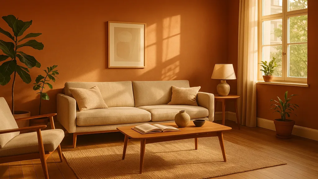
A heathered plum with velvety brown undertones. This is not a timid colour — it is rich, complex, and inherently warm. Benjamin Moore describes it as “grounding and sophisticated,” and it represents a significant departure from the cool neutrals that dominated for a decade.
Where it works: Accent walls, powder rooms, home offices, and feature walls where you want drama without aggression. Pair with warm whites, natural wood, and brass fixtures.
Sherwin-Williams: Upward (SW 6239)
A light, breezy blue with cool undertones — more subtle than the previous year’s selections. Sherwin-Williams positioned this as a calming, optimistic shade that opens up spaces.
Where it works: Bedrooms, bathrooms, and family rooms where a serene, airy atmosphere is the goal. Pairs well with white trim and natural wood accents.
Dulux: Sweet Embrace
A soft, warm pink-beige that reads as a modern neutral. This shade captures the broader shift from cool greys to warm neutrals — it is essentially “the new beige” refined for contemporary sensibilities.
Where it works: Living rooms, hallways, and open-concept main floors. An excellent whole-home neutral that feels warm without being overpowering.
The Bigger Trend: Warm Neutrals Replace Cool Greys
The individual colours matter less than the collective message:
- Warm undertones dominate: Every major brand has moved away from cool, blue-based greys toward warm, earthy tones
- Colour confidence is growing: Homeowners are more willing to use saturated, expressive colours in strategic locations rather than defaulting to safe, neutral everything
- Nature-inspired palettes: Greens, browns, warm blues, and earthy reds are all present — colours drawn from landscapes, not industrial materials
- Matte finishes: The shift toward warmer colours is accompanied by a preference for matte and low-sheen finishes that feel organic rather than glossy
Practical Advice for Niagara Homeowners
Do Not Chase the Colour of the Year
These annual picks are marketing events as much as design guidance. Painting your entire home in the colour of the year is like buying an outfit because it was on a magazine cover — it may not suit you.
Instead, use the colour-of-the-year selections as directional cues. The collective message in 2024 is clear: warm tones, earthy palettes, and the confidence to use colour intentionally.
Where to Use Bold Colour
- Powder rooms: The perfect testing ground for bold colour. Small space, high impact, easy to repaint.
- Accent walls: A single wall in a richer tone adds depth to a room painted in a coordinating neutral.
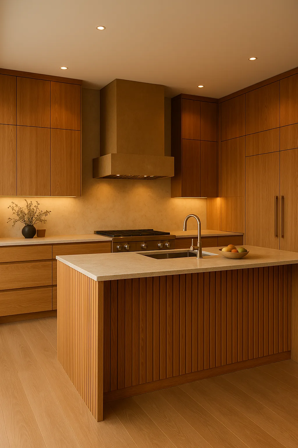
- Kitchen islands: A painted island in a saturated colour (sage, navy, charcoal) creates a focal point.
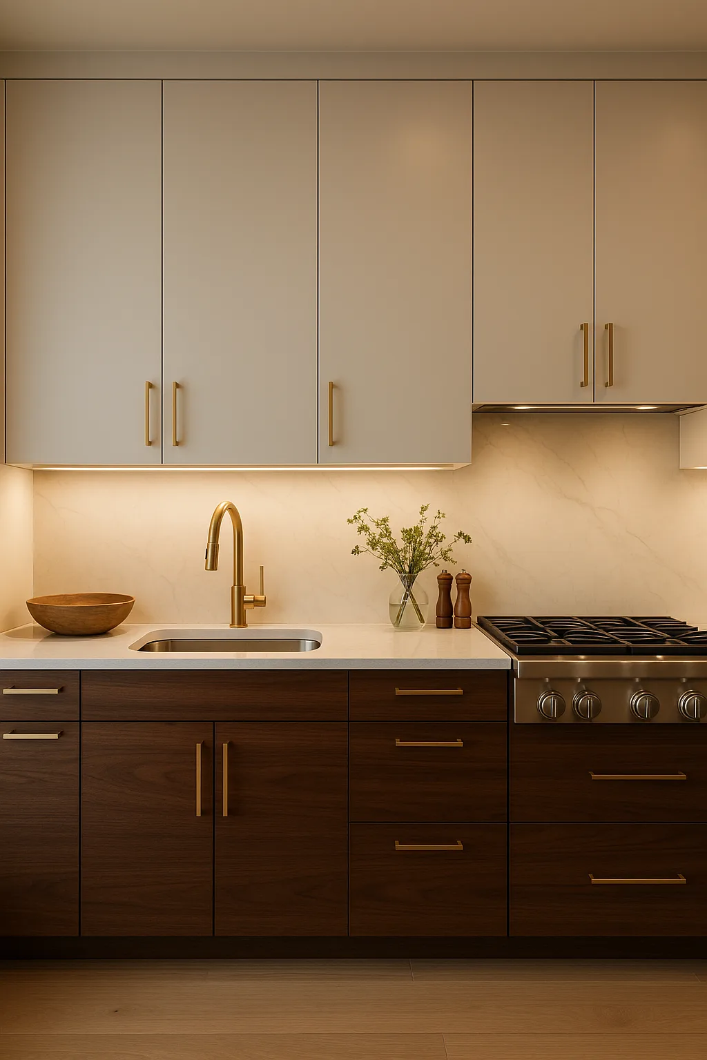
- Cabinetry: Coloured lower cabinets with white or light uppers add personality without overwhelming.
- Home offices: A warm, enveloping colour creates focus and comfort for remote work.
Where to Stay Neutral
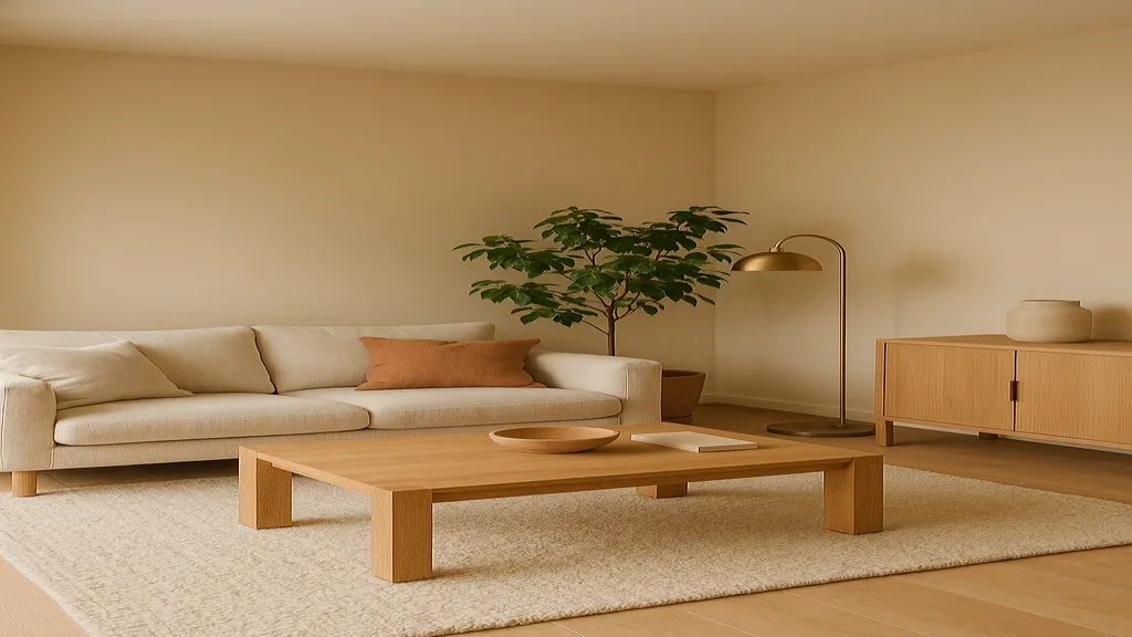
- Open-concept main floors: Use warm neutrals (warm white, cream, light greige) that flow smoothly between connected spaces
- Ceilings: Warm white or the same shade as the walls creates cohesion
- Kitchens (overall palette): Keep the dominant surfaces neutral and add colour through the island, backsplash, or hardware
Test Before Committing
Paint colours look dramatically different on a wall than they do on a chip. Always:
- Purchase a sample pot
- Paint a 2x2-foot swatch on the actual wall
- Observe it at different times of day (morning light versus evening lamp light)
- Live with it for at least 48 hours before deciding
Niagara’s natural light — which varies significantly between lakeside communities and inland areas — affects how colours appear. A colour that looks warm and inviting in a south-facing St. Catharines living room may look completely different in a north-facing room in Thorold.
If you are planning a renovation and want expert colour guidance, contact JVR Complete. Colour consultation is built into every project we undertake.