Nach vielen Jahren mit Küchenberatungen in der gesamten Niagara-Region habe ich mir eine mentale Checkliste mit Designfehlern angeeignet, die in rund der Hälfte aller Küchen auftauchen, die ich begutachte. Es sind keine baulichen Mängel und keine Verstöße gegen Bauvorschriften — es sind Designentscheidungen, die eine ansonsten funktionierende Küche untergraben.
Das Frustrierende daran ist: Die meisten dieser Fehler zu vermeiden kostet genauso viel wie sie zu begehen. Der Unterschied liegt allein in Bewusstsein und Planung.
Fehler 1: Die Küche mit nur einer Lichtquelle
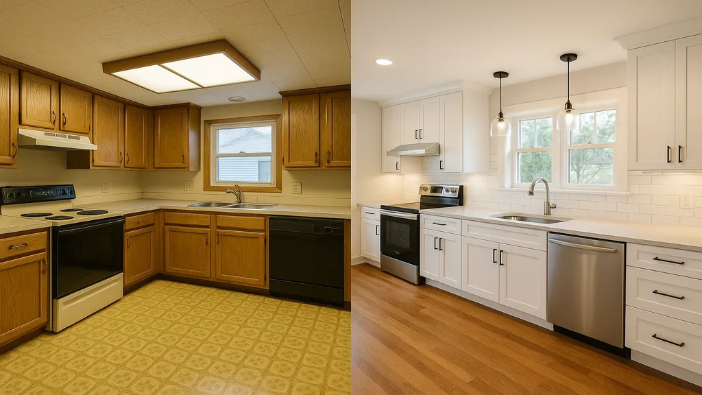
Das ist der häufigste Fehler im Küchendesign, der mir begegnet. Eine einzelne Deckenleuchte — meist eine flach montierte Deckenleuchte oder eine einsame Leuchtstoffröhre — sorgt für flaches, schattenloses Licht, das die gesamte Küche an einen Krankenhausflur erinnern lässt.
Eine gut beleuchtete Küche braucht drei Lichtebenen:
- Arbeitslicht: LED-Leisten unter den Oberschränken, die die Arbeitsflächen auf den Arbeitsplatten ausleuchten. In einer modernen Küche ist das nicht verhandelbar.
- Grundbeleuchtung: Einbaustrahler oder eine zentrale Leuchte, die den Raum insgesamt ausleuchtet.
- Akzentbeleuchtung: Pendelleuchten über der Kochinsel, beleuchtete Vitrinenschränke oder Sockelbeleuchtung, die Wärme und visuelle Tiefe schaffen.
Jede dieser Ebenen sollte über einen eigenen Schalter oder Dimmer laufen, damit Sie die Stimmung anpassen können — vom vollen Arbeitslicht beim Kochen bis zur gemütlichen Abendbeleuchtung beim Empfang von Gästen.
Fehler 2: Der Spritzschutz im falschen Maßstab
Maßstab ist eines der am meisten missverstandenen Konzepte im Küchendesign. Eine winzige Mosaikfliese von 5 × 5 cm kann hinter einem modernen Herd unruhig und altmodisch wirken. Eine riesige Platte von 60 × 120 cm kann eine kleine Schlauchküche erdrücken.
Der Spritzschutz muss proportional zu den Schränken, den Arbeitsplatten und der Gesamtgröße des Raums passen. Als Faustregel gilt:
- Kleine Küchen profitieren von mittelformatigen Fliesen (etwa Metro-Fliesen im Format 7,5 × 15 cm), die Rhythmus schaffen, ohne den Raum zu erdrücken
- Große Küchen vertragen großformatige Fliesen oder Natursteinplatten, die nahtlose, eindrucksvolle Hintergründe bilden
- Das Verlegemuster ist genauso wichtig wie das Format — ein Fischgrät- oder vertikales Verband-Muster kann dieselbe Fliese völlig anders wirken lassen
Fehler 3: Das blockierte Arbeitsdreieck
Das Küchen-Arbeitsdreieck — das Zusammenspiel von Spüle, Herd und Kühlschrank — prägt das Küchendesign seit Jahrzehnten. Wenn eine Kochinsel, eine Halbinsel oder ein schlecht platziertes Gerät den natürlichen Lauf zwischen diesen drei Punkten unterbricht, wird die Küche im Alltag zur Geduldsprobe — egal wie schön sie aussieht.
Am häufigsten beobachte ich das bei überdimensionierten Kochinseln. Hausbesitzer wünschen sich die größtmögliche Insel und merken dabei nicht, dass eine für den Raum zu große Insel enge Laufwege erzeugt — mit der Folge, dass man sich seitlich zwischen Insel und Arbeitszeile durchschieben muss.
Die Faustregel: An allen Seiten einer Kochinsel mindestens 107 cm (idealerweise 122 cm) Bewegungsfreiheit lassen. Lässt sich dieser Abstand bei Ihrer Wunschgröße der Insel nicht einhalten, muss die Insel schrumpfen.
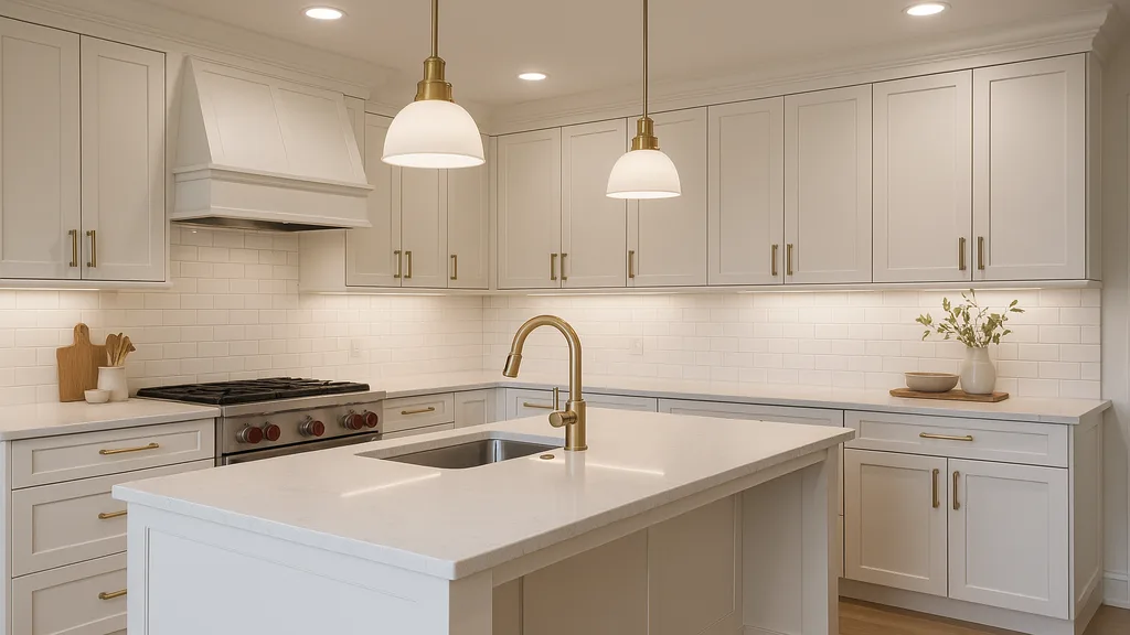
Fehler 4: Nicht aufeinander abgestimmte Beschlagsoberflächen
Beschläge sind der Schmuck einer Küche, und wie Schmuck wollen sie aufeinander abgestimmt sein. Regelmäßig sehe ich Küchen mit Armaturen in Chrom, Griffen in gebürstetem Nickel, Leuchten in dunkler Bronze und Geräten in Edelstahl — vier verschiedene Metalloberflächen, die alle um Aufmerksamkeit konkurrieren.
Der aktuelle Trend zu gemischten Metallen kann wunderbar funktionieren — aber nur mit klarer Absicht. Wählen Sie eine dominante Metalloberfläche für Beschläge und Armaturen und setzen Sie dann eine (höchstens zwei) Akzentmetalle ganz gezielt in kleineren Details ein.
Fehler 5: Den Stauraum vergessen
Es klingt offensichtlich, aber viele Küchenrenovierungen reduzieren tatsächlich den nutzbaren Stauraum. Hausbesitzer entfernen Oberschränke zugunsten offener Regale (die weniger fassen und ständiges Aufräumen erfordern), installieren eine dekorative Dunstabzugshaube, die einen Schrankplatz eliminiert, oder wählen ausschließlich Schubladen, ohne zu bedenken, dass einige Gegenstände besser in Regalen aufbewahrt werden.
Bevor ich ein Küchendesign finalisiere, inventarisiere ich den vorhandenen Kücheninhalt des Kunden und plane den Stauraum so, dass er alles aufnimmt, was tatsächlich genutzt wird — plus 15 Prozent Wachstumsreserve.
Fehler 6: Fehler bei Arbeitsplattenüberständen
Ein Arbeitsplattenüberstand einer Kochinsel für Sitzgelegenheiten muss mindestens 30 cm tief sein, um bequem zu sein – ideal sind 38 cm. Regelmäßig sehe ich Überstände von nur 20 bis 23 cm – gerade tief genug, dass jemand versucht zu sitzen, aber nicht tief genug, um es bequem zu finden. Die Hocker werden zur Seite geschoben, und der Sitzbereich bleibt ungenutzt.
Berücksichtigen Sie auch die Höhe: Eine Standard-Arbeitsplattenhöhe von 91 cm erfordert 61-cm-Barhocker. Eine erhöhte Barhöhe von 107 cm erfordert 76-cm-Barhocker. Eine Verwechslung bedeutet entweder baumelnde Füße oder eingeklemmte Knie.
Fehler 7: Vernachlässigung der Belüftung
Eine schöne Dunstabzugshaube, die nicht tatsächlich nach außen entlüftet, ist nur eine dekorative Box. Umlufthauben filtern etwas Fett, tun aber nichts gegen Hitze, Feuchtigkeit oder Kochgerüche. Wenn Sie in eine Küchenrenovierung investieren, investieren Sie in eine ordnungsgemäße Belüftung mit einem Abluftkanal nach außen.
Die Design-First-Lösung
Jeder dieser Fehler ist durch eine sorgfältige Designplanung vor Baubeginn vermeidbar. Bei JVR Complete fangen wir diese Probleme in der Designphase ab — nicht erst, nachdem die Schränke installiert und die Fliesen verfugt sind.
Wenn Sie eine Küchenrenovierung in St. Catharines oder irgendwo in der Niagara-Region planen, kontaktieren Sie JVR Complete für eine Designberatung, die kostspielige Fehler verhindert.